Income
Sharpe: 4.65Return: +28.8%Max DD: +1.4%Win: +96.1%Tickers: 4
We continuously research, build, and validate systematic trading ideas with robust testing, then share transparent results so everyone can access evidence-based quant insights, not just institutions. We backtest quantitative trading strategies across global equity indices, options analysis on US index ETFs, portfolio optimization, sentiment tracking, and market regime detection - all with live data updated daily. Each strategy is documented with methodology, assumptions, risk metrics, drawdown behavior, and implementation notes so readers can evaluate both strengths and limitations before using any idea in practice. We focus on reproducible workflows: clear inputs, explainable rules, out-of-sample checks, and comparable reporting across assets and market regimes. From indicator research and options structures to portfolio construction and risk-control experiments, the goal is simple: make serious quantitative research transparent, verifiable, and useful for independent builders.
| Strategy Library | 70+ technical indicator-based strategies backtested across 21 global equity indices with 5 years of daily data. Each strategy page includes equity and drawdown paths, trade diagnostics, risk-adjusted metrics, parameter sensitivity context, and Python reference code so ideas can be reviewed and reproduced instead of treated as black-box signals. |
| Options Strategies | 18 options strategies — from cash-secured puts and covered calls to iron condors, jade lizards, and synthetic longs — backtested on SPY, QQQ, IWM, and DIA using live IV surfaces and Black-Scholes pricing. Results are broken down per symbol with return, drawdown, win-rate, exit behavior, and implementation notes so premium, directional, spread, and hedge structures can be compared on the same basis. |
| Portfolio Optimization | 30 systematic portfolio strategies built on S&P 500 stocks using factor signals (momentum, volatility, quality, trend). Skfolio-powered optimization compares Max Sharpe, Min Variance, Risk Parity, HRP, and related allocators across US and global universes with transparent assumptions, constraints, and risk-return tradeoff reporting. |
| Parameter Optimization | Grid search over each strategy's key parameters, optimizing for Sharpe ratio, Sortino, Calmar, win rate, and profit factor. Outputs are shown as line charts (1-parameter) and scatter/heatmap surfaces (2-parameter) so you can identify robust ranges, instability zones, and overfit-looking peaks before selecting settings. |
| Market Analysis | Relative Rotation Graphs for US equity and sector ETFs vs S&P 500, correlation matrix analysis across strategies, stock sentiment tracking with VADER on financial headlines, and market regime detection via GMM/HMM models. These tools provide cross-sectional and regime context to interpret when a strategy environment is supportive, mixed, or hostile. |
| Project Research | Project research modules cover adaptive portfolios (OLPS), K-means clustering portfolio construction, execution/risk experiments, and regime-aware studies. Each project pairs interactive visualizations with methodology documentation, assumptions, and source-linked implementation details to keep the research auditable and practical. |
Data as of 2026-07-18
Abbreviations
This panel summarises US Treasury term-structure dynamics: inversion diagnostics on benchmark spreads, Nelson–Siegel level, slope, and curvature, and a macro risk regime that combines curve shape with equity drawdown context. It is a condensed view of the live monitor in our Yield Curve Intelligence study, where the full factor history, regime tables, and methodology are documented.
The figures below update from the latest available curve snapshot. The headline cards report the current 10Y–3M spread, the classified regime, and how often the curve has been inverted over the sample; the chart traces the same spreads through the most recent sessions so you can judge whether flattening is isolated or persistent.
Read spreads against zero: negative values mean short rates exceed long rates for that pair. A brief dip below zero is not, by itself, a recession signal; sustained inversion—especially when it aligns with risk-off equity conditions—has more often preceded macro slowdowns, though lead times and severity still vary by cycle.
This section tracks recurring calendar effects in US equity sectors using eleven SPDR Select Sector ETFs (GICS) and SPY as the benchmark. Each heatmap cell is the unconditional average monthly total return for that sector in that calendar month, pooled across all years in the sample from 2019 onward.
What this widget shows
Full methodology, cyclical vs defensive tables, quarterly profiles, benchmark-relative rotation, and exploratory t-tests are on the Calendar Effects in US GICS Sector ETFs project page.
Composite leaders and average value, quality, and growth scores by sector from the latest US large-cap fundamentals dataset.
View fundamental stock analysis projectGenerated Saturday, Jul 18, 2026
| # |
|---|
Ranked snapshot of strategy performance metrics.
No fundamental strategy dataset found yet. Run npm run data:fundamental-strategies.
Income
Income
Income
Neutral
Neutral
Neutral
Directional
Directional
| # | |||||||
|---|---|---|---|---|---|---|---|
| 1 | Cash-Secured Put | Income | 4.65 | +28.8% | +1.4% | +96.1% | 4 |
| 2 | Short Puts | Income | 4.65 | +28.8% | +1.4% | +96.1% | 4 |
| 3 | Cash-Secured Put | Income | 4.65 | +28.8% | +1.4% | +96.1% | 4 |
| 4 | Short Strangle | Neutral | 1.44 | +47.0% | +2.0% | +85.5% | 4 |
| 5 | Short Strangles | Neutral | 1.44 | +47.0% | +2.0% | +85.5% | 4 |
| 6 | Jade Lizard | Neutral | 0.97 | +30.8% | +2.7% | +75.0% | 4 |
| 7 | 1x2 Call Ratio Spread | Directional | 0.92 | +709.5% | +33.7% | +77.6% | 4 |
| 8 | Call Front Spread | Directional | 0.92 | +709.5% | +33.7% | +77.6% | 4 |
Loading portfolio strategies…
| 1. | Signal Generation Framework | Modular framework for generating trading signals from multiple data sources. Supports technical indicators, fundamental analysis, machine learning models, and custom signal generators. Includes signal validation, filtering, and combination logic to create robust entry and exit signals. |
| 2. | Execution Engine | High-performance order execution framework with support for multiple broker APIs and exchange connections. Features include order routing, slippage management, fill simulation, and real-time position tracking. Designed for both backtesting and live trading environments. |
| 3. | Risk Management System | Comprehensive risk management framework with position sizing, portfolio-level risk limits, drawdown controls, and real-time risk monitoring. Implements VaR calculations, position concentration limits, and dynamic risk adjustment based on market conditions and strategy performance. |
| 4. | Portfolio Management | Advanced portfolio construction and optimization framework. Supports multiple optimization objectives including Sharpe ratio maximization, risk parity, minimum variance, and custom utility functions. Includes rebalancing logic, transaction cost modeling, and constraint handling. |
| 5. | Data Pipeline & Processing | Scalable data ingestion and processing framework for market data, fundamental data, and alternative data sources. Features real-time data streaming, historical data management, data quality checks, and normalization. Supports multiple data formats and timeframes. |
| 6. | Backtesting Infrastructure | Robust backtesting framework with realistic market simulation, including bid-ask spreads, market impact, and partial fills. Supports walk-forward analysis, Monte Carlo simulation, and out-of-sample testing. Provides detailed performance metrics and attribution analysis. |
| 7. | Strategy Orchestration | Framework for managing multiple strategies simultaneously with resource allocation, priority queuing, and conflict resolution. Includes strategy lifecycle management, performance monitoring, and automated strategy deployment and retirement mechanisms. |
| 8. | Monitoring & Alerting | Real-time monitoring framework for system health, strategy performance, and market conditions. Features customizable alerts, performance dashboards, and automated reporting. Includes anomaly detection and automated response mechanisms for critical events. |
Per-cluster training statistics—count, mean return, volatility, Sharpe, and beta—for K-means groups on scaled risk/return features. Full methodology, charts, and validation backtests are on the Diversified Stock Portfolio Clustering project page.
| Cluster | Count | Return | Vol | Sharpe | Beta |
|---|---|---|---|---|---|
| 1 | 56 | 24.9% | 33.1% | 0.78 | 1.09 |
| 2 | 12 | -8.4% | 59.0% | -0.15 | 1.94 |
| 3 | 41 | -9.1% | 32.4% | -0.29 | 0.87 |
| 4 | 86 | 6.3% | 24.6% | 0.27 | 0.71 |
Mean return
Mean volatility
Mean Sharpe
Online portfolio selection (OLPS) updates weights each period from past prices alone—no forward-looking labels—making it a natural test bed for adaptive allocation under regime change. This study benchmarks fourteen published and baseline rules (momentum, mean-reversion, and pattern-learning families) on a diversified six-ETF sleeve spanning US equity, international equity, emerging markets, Treasuries, inflation-linked bonds, and REITs (VTI, EFA, EEM, TLT, TIP, VNQ).
Each algorithm is estimated on 2015–2022 daily closes and evaluated out-of-sample on 2023–2024 with daily rebalancing, zero look-ahead, and wealth indices reset to 1.0 at the test start. SPY and an equal-weight universe portfolio (UFR) anchor absolute performance; a 0.1% per-trade fee variant is tracked in the full project for turnover-sensitive strategies.
The panels below highlight the leading test-period strategies and a cross-sectional risk–return map across fourteen OLPS rules on a six-ETF sleeve (VTI, EFA, EEM, TLT, TIP, VNQ). For universe setup, equity paths, fee stress tests, and the full metrics table, see the Adaptive Portfolio Strategies project page.
| Algorithm | Type | Sharpe ↓ | Return | Vol | Max DD |
|---|---|---|---|---|---|
| PAMR | Follow-the-Loser | 2.88 | 104.90% | 15.10% | -9.20% |
| OLMAR | Follow-the-Loser | 2.07 | 70.21% | 14.81% | -6.67% |
| BCRP | Benchmark | 1.94 | 57.24% | 13.21% | -10.72% |
| RMR | Follow-the-Loser | 1.18 | 38.12% | 14.92% | -7.99% |
| Anticor | Follow-the-Loser | 1.12 | 24.36% | 10.37% | -9.15% |
| BAH | Benchmark | 0.86 | 18.12% | 10.10% | -11.57% |
| EG | Follow-the-Winner | 0.85 | 17.80% | 10.06% | -11.58% |
| CRP | Benchmark | 0.85 | 17.78% | 10.05% | -11.58% |
| ONS | Follow-the-Winner | 0.85 | 17.77% | 10.05% | -11.58% |
| CWMR | Follow-the-Loser | 0.85 | 17.78% | 10.05% | -11.58% |
| CORN | Pattern Matching | 0.85 | 17.77% | 10.05% | -11.58% |
| BNN | Pattern Matching | 0.85 | 17.76% | 10.05% | -11.58% |
| UP | Follow-the-Winner | 0.82 | 17.90% | 10.48% | -12.14% |
| Kelly | Pattern Matching | -0.03 | -0.67% | 11.14% | -18.57% |
What this shows: Sharpe ratio before and after applying 0.1% transaction fees.
How to read it: The gap between paired bars is fee drag; larger gaps identify turnover-heavy strategies.
| 1. | 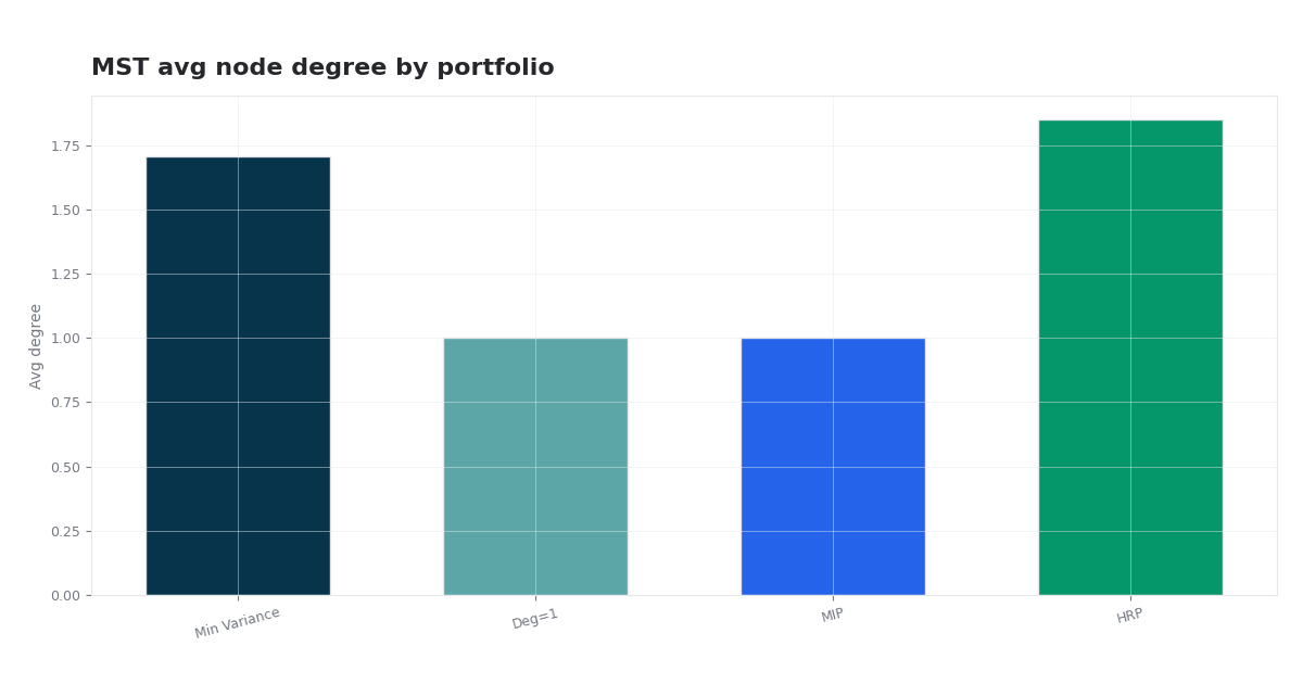 Nifty 50 Graph-Constrained Portfolio Optimization India · MST and TMFG networks on Nifty 50 with average-centrality and neighborhood constraints inside mean–variance programs, compared with HRP, HERC, and NCO. | 2026 | MST · TMFG · Centrality · Neighborhood MIP |
| 2. | 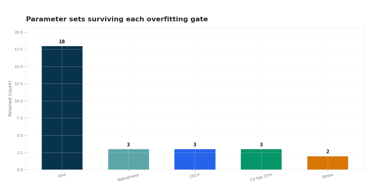 Detecting Overfitting in Momentum Strategies Multi-stage overfitting diagnostics for S&P 500 J/K/N winners-only momentum: DSR, disparity, sensitivity, block bootstrap, CSCV/PBO, walk-forward CV, and stress-tested selection. | 2026 | J/K/N · Deflated Sharpe · CSCV/PBO · walk-forward · stress tests |
| 3. | 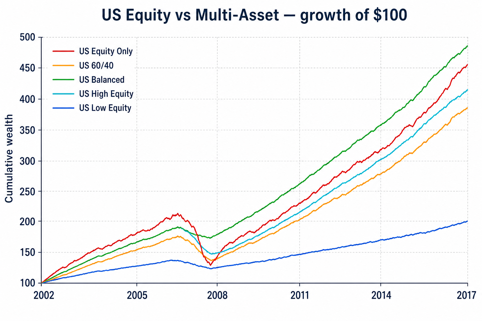 US Equity vs US Multi-Asset Risk-Adjusted Study Comparative allocation study of US equity-only versus US multi-asset portfolios (stocks, bonds, REITs) with hypothesis testing, frontier diagnostics, and interactive risk-adjusted analytics. | 2026 | US equity · US bonds · REITs · Sharpe tests · drawdown tests · interactive diagnostics |
| 4. |  India Six-Factor Premia, Attribution & Regime Analysis India · Six-factor study of Indian equities: long-run premia, Nifty style-index regressions, momentum crash risk, mutual-fund attribution, and whether quality pays in downturns — with interactive charts. | 2026 | FF6 · Nifty indices · Fund attribution |
| 5. | 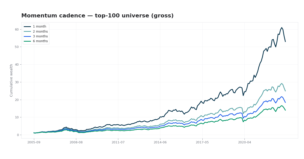 Momentum Cadence and Portfolio Design in Indian Equities India · A systematic grid study of long-only 12-1 momentum on Indian equities: how rebalance interval, universe breadth, holdings count, and weighting scheme interact — with overlapping portfolios, transaction costs, and six-factor attribution. | 2026 | 12-1 momentum · 144 configurations · net of costs |
| 1. | Nifty 50 Graph-Constrained Portfolio Optimization MST and TMFG networks on Nifty 50 with average-centrality and neighborhood constraints inside mean–variance programs, compared with HRP, HERC, and NCO. | 2026 | MST · TMFG · Centrality · Neighborhood MIP |
| 2. | India Six-Factor Premia, Attribution & Regime Analysis Six-factor study of Indian equities: long-run premia, Nifty style-index regressions, momentum crash risk, mutual-fund attribution, and whether quality pays in downturns — with interactive charts. | 2026 | FF6 · Nifty indices · Fund attribution |
| 3. | Momentum Cadence and Portfolio Design in Indian Equities A systematic grid study of long-only 12-1 momentum on Indian equities: how rebalance interval, universe breadth, holdings count, and weighting scheme interact — with overlapping portfolios, transaction costs, and six-factor attribution. | 2026 | 12-1 momentum · 144 configurations · net of costs |
| 4. | 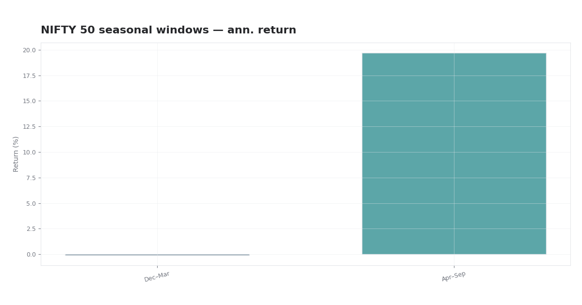 NIFTY 50 Seasonal Analysis by Industry & SARIMA Report on NIFTY 50 calendar seasonality by industry: equal-weight sector baskets, cyclical vs defensive cycle spreads, benchmark-relative correlation, and SARIMA index diagnostics with full mathematical framework. | 2026 | Sector baskets · Industry cycle · SARIMA |
| 5. | 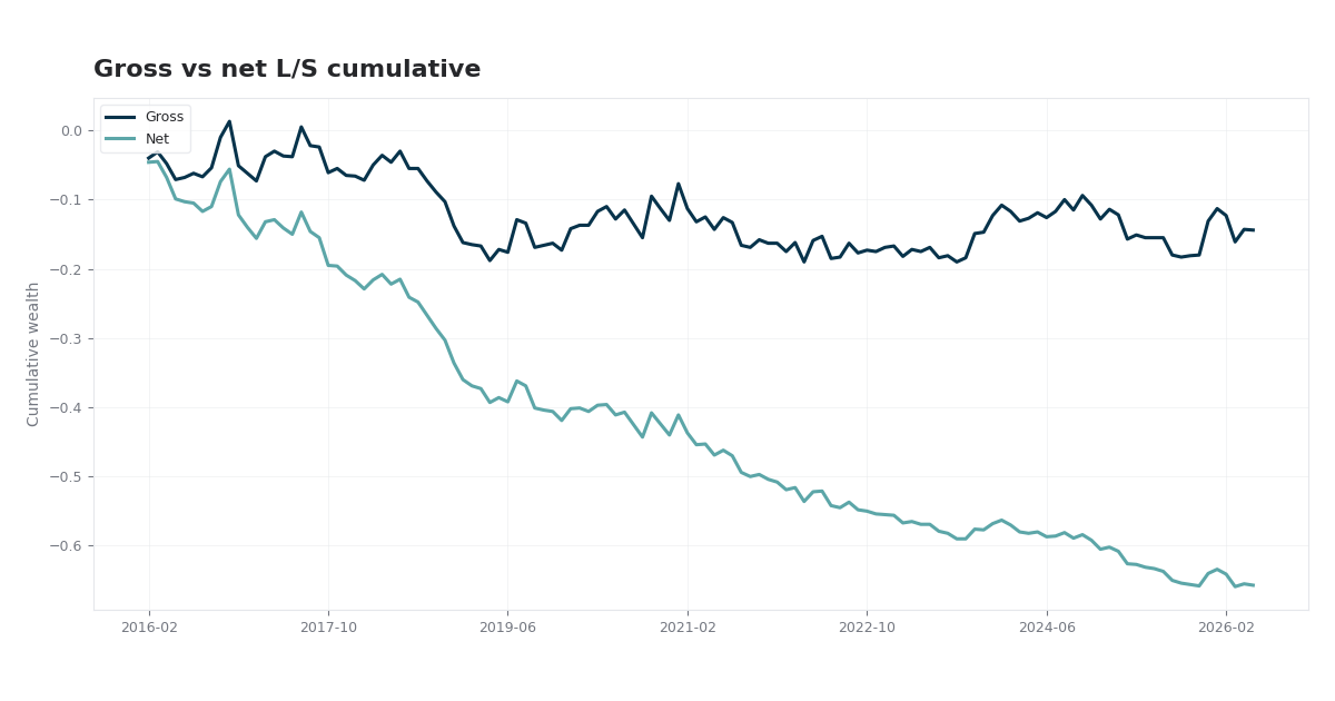 Nifty 50 Value-Momentum-Size Long-Short Strategy Nifty 50 Value, Momentum, and Size: Fama–MacBeth premia, IC/IR, and a 20%/20% long–short backtest on NSE data via yfinance — with interactive performance charts. | 2026 | Nifty 50 · Fama–MacBeth · L/S |
Updated about 10 hours ago (latest item)
| 1. | Inflation Isn't Just a Trumpflation Problem Any Longer -- There's a New Culprit, and It Has Potentially Dire Implications for Wall StreetSentiment pipeline · about 10 hours ago |
| 2. | Why has Austria become Europe's hottest AI market this year?Sentiment pipeline · about 10 hours ago |
| 3. | VTI Is Cheaper Than It Used to Be. So What's the Catch?Sentiment pipeline · about 10 hours ago |
| 4. | Robinhood Targets 27.6M Customers as Chain Moves Beyond Memecoin RushSentiment pipeline · about 10 hours ago |
| 5. | Stock Market Losses Led By Nasdaq, AI Stocks; Goldman, GE, Taiwan Semi, IBM In Focus: Weekly ReviewSentiment pipeline · 1 day ago |
| 1. | Statistical Modeling | Advanced regression analysis, time series forecasting, and multivariate statistical methods for complex data patterns. |
| 2. | Strategy Comparator | Compare up to 4 strategies side-by-side using Sharpe, return, drawdown, win rate, and trade count. |
| 3. | Stock Sentiment Tracker | US equity only: live prices and news sentiment (VADER) for major US stocks. See Sentiment page. |
| 4. | Risk Analytics | Comprehensive risk assessment frameworks including VaR, CVaR, and stress testing methodologies. |
| 5. | Data Pipeline | High-performance data processing infrastructure designed for large-scale quantitative analysis. |
| 6. | HFT Latency Budget Calculator | Plan per-stage p99.9 tick-to-trade budgets and detect bottlenecks before live deployment. |
| 7. | Portfolio Optimization | Modern portfolio theory implementation with multi-objective optimization and constraint handling. |