Risk reports & stop / take-profit analysis
How diversified equity and options backtests look in risk–return space, plus a controlled experiment on stops and profit targets. The still images summarize many backtests at once (equity indices and listed options on ETFs). The interactive block at the bottom is a teaching exercise: the same basket of simple strategies is run again on one index with different stop-loss and take-profit settings, so you can see how averages move when you change rules.
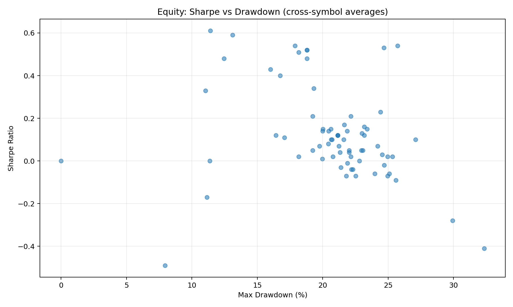
Equity index strategies
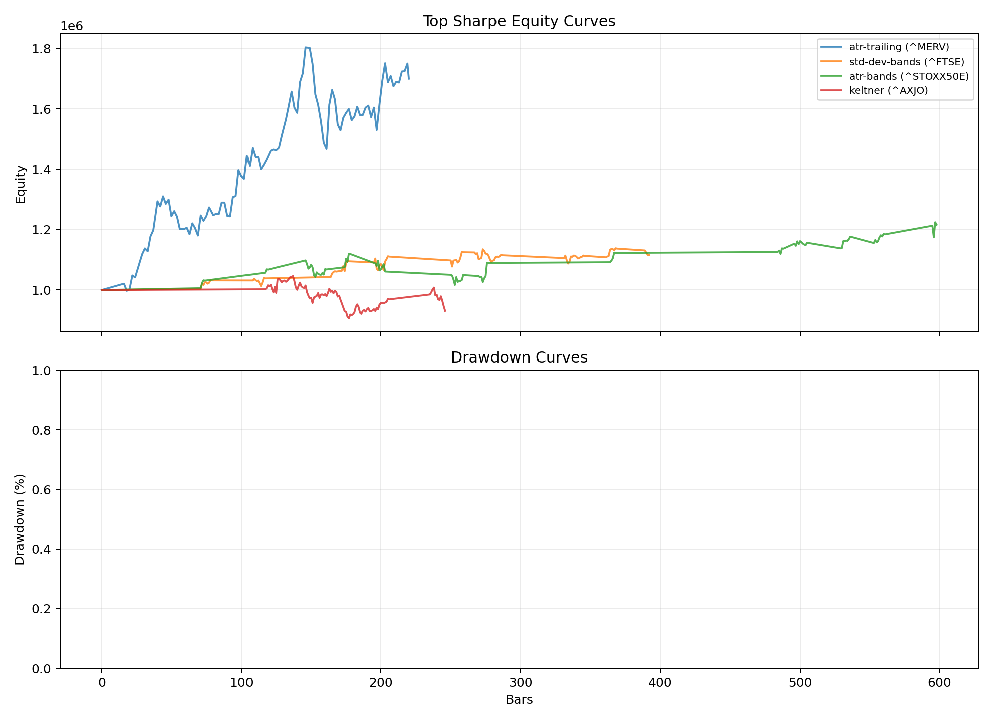
Each scatter dot is one strategy averaged across all index backtests. Use the dropdown on the paths chart to pick any strategy and see that same cross-index mean as equity and drawdown over time.
Each dot is one strategy, with Sharpe and max drawdown averaged across all 20 index backtests. Compare rules on a level playing field, not a single lucky market.
Use the dropdown to pick any strategy. Each path averages normalized equity and drawdown across every index backtest (same basis as the scatter).
Options on US index ETFs
54 options strategies on SPY, QQQ, IWM, and DIA (metrics averaged per strategy). Stacked vertical bar charts show win rate and avg return per trade separately (see chart caption). Bar and scatter colors use strategy category (Income, Directional, Spread, Volatility, Neutral, Hedge). All four charts use the same simulated exits on the underlying ETF (stop, target, or 45-DTE expiry).
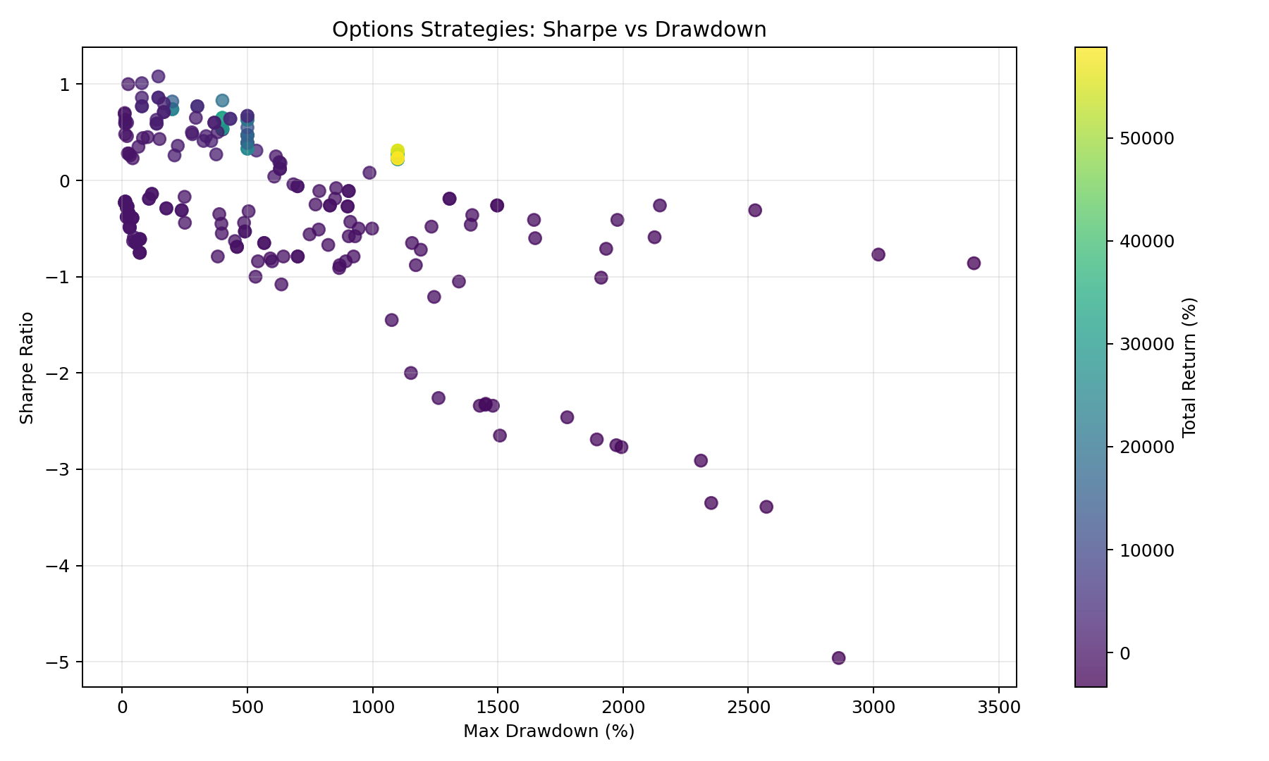
One dot per strategy: mean Sharpe and drawdown across SPY, QQQ, IWM, and DIA. Metrics come from trades that can exit on underlying stop-loss / take-profit or at 45-DTE expiry (not hold-to-expiry only when risk controls are on).
Reading the chart
- Sample period: Aug 2024 – Feb 2026 (~18 months), 19 rolling 45-DTE cycles on SPY, QQQ, IWM, and DIA.
- Same axes as the equity scatter: drawdown (%) vs Sharpe, but each point averages four ETF backtests.
- Each dot’s Sharpe and drawdown reflect realized P&L after simulated SL/TP on the ETF path (see risk note on the chart when present).
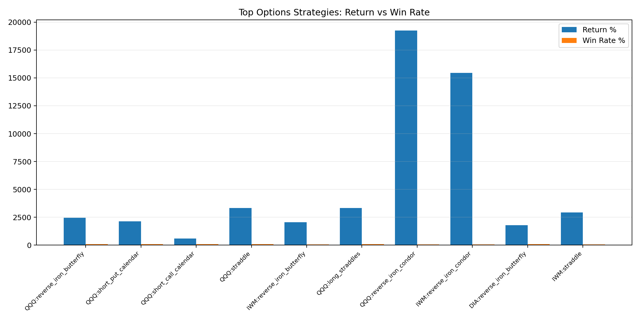
Vertical bar charts for all 54 strategies (metrics averaged across SPY, QQQ, IWM, and DIA). Win rate and avg return per trade use the same risk-managed exits as the scatter (underlying SL/TP when enabled, else 45-DTE expiry).
Reading the chart
- Sample period: Aug 2024 – Feb 2026 (~18 months) with 19 rolling 45-DTE entries, rolled every ~21 trading days on SPY, QQQ, IWM, and DIA (see report JSON for exact dates).
- Two stacked charts (not one shared axis): top = win rate (%), bottom = average return per trade (%). Summing every trade’s PnL % can exceed 1,000% and is not plotted; tooltip shows that sum on request.
- Bars are not “expiry-only” returns when risk controls are active — early stops and targets change both win rate and average return per trade.
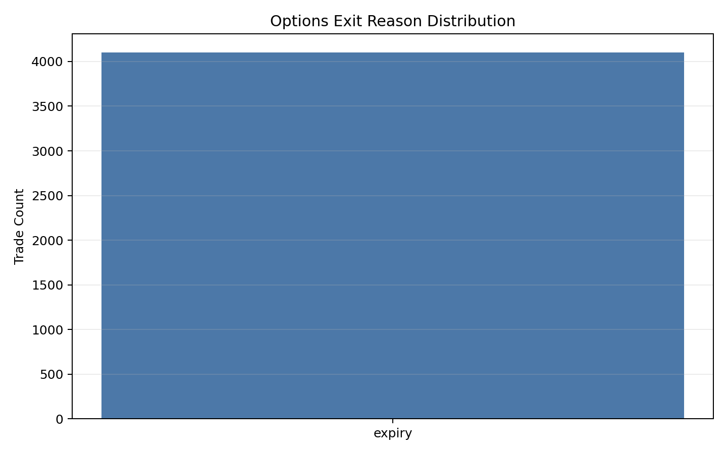
Counts trades by simulated exit rule: stop-loss and take-profit on the underlying ETF path, max-hold time, or hold to 45-DTE expiry. Requires options analysis run with risk controls enabled.
Reading the chart
- A single bar means every trade in the stored backtest exited at expiry — the JSON was built without underlying stop-loss / take-profit (re-run with --stop-loss-pct and --take-profit-pct).
- Multiple bars: compare how often stops cut losers vs targets bank gains vs holding through expiry.
- These are model exits on the index price path, not broker fill types (roll, assignment, etc.).
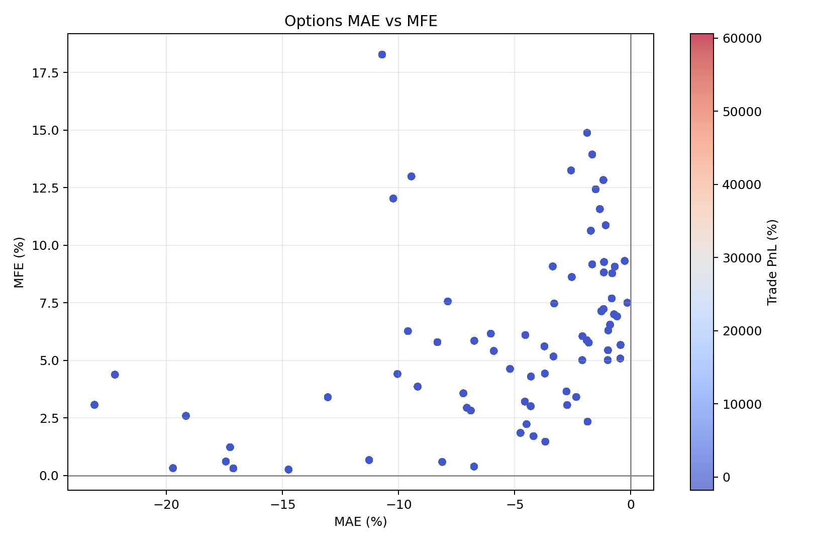
MAE = worst unrealized loss versus entry while the trade was open. MFE = best unrealized profit before exit. Each point is one completed trade, exited via the same underlying SL/TP / expiry rules as the other options charts.
Reading the chart
- Horizontal: MAE (%), vertical: MFE (%). Points toward the upper-right had room to move both ways intratrade.
- Color shows realized P&L (%) at the simulated exit bar (stop, target, or 45-DTE expiry) — not P&L as if every trade ran full term.
- Many reds with very negative MAE can mean stops were wide or the structure bled before exit rules fired.
Stop / target experiment (static figures)
These match the interactive charts below: one symbol, one horizon, many strategies, several stop and take-profit configurations. Use the PNGs for slides or print; use the live charts to hover exact numbers.
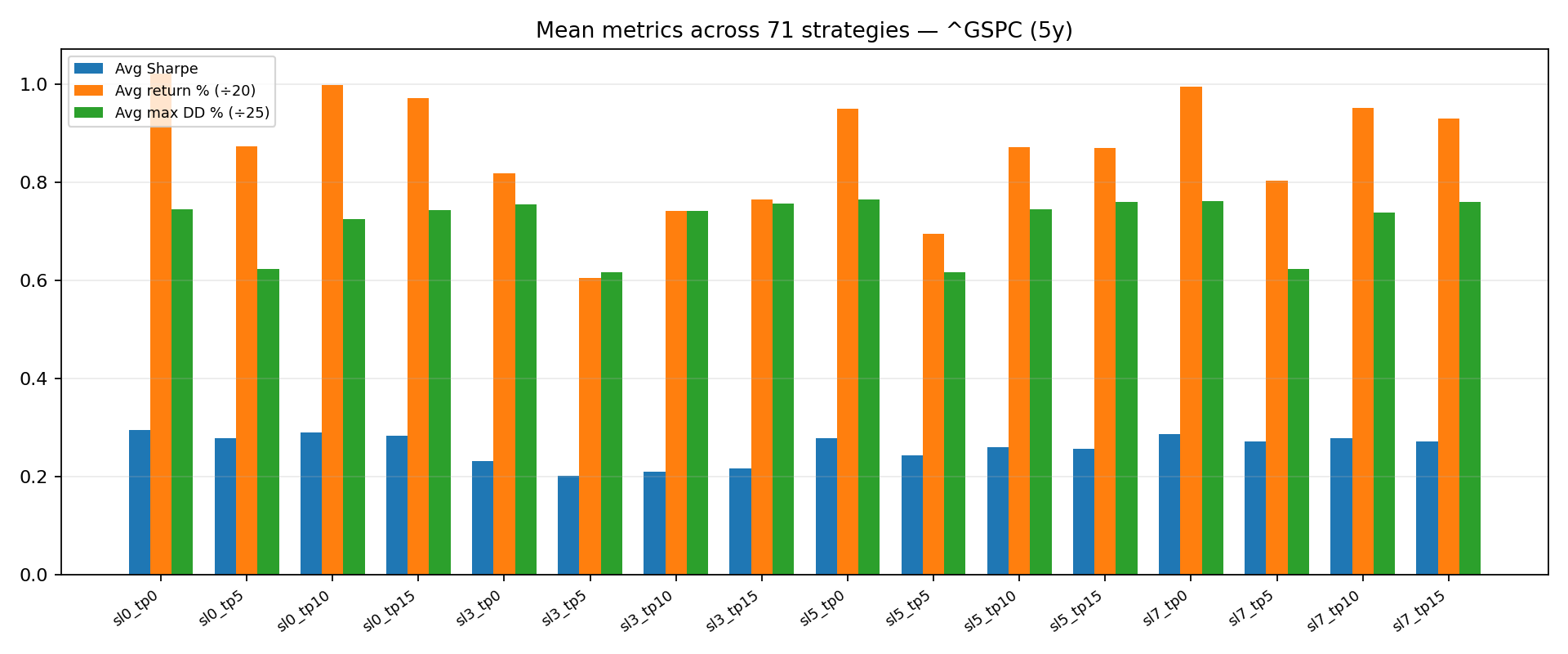
Compares several risk settings applied to the same basket of simple strategies on one index. Bars summarize averages across that basket.
Reading the chart
- This PNG may rescale series so all three fit visually; use the interactive chart on this page for raw numbers on one scale.
- Read across: baseline vs stop-only vs target-only vs combined tells you which rule family moves the average the most.
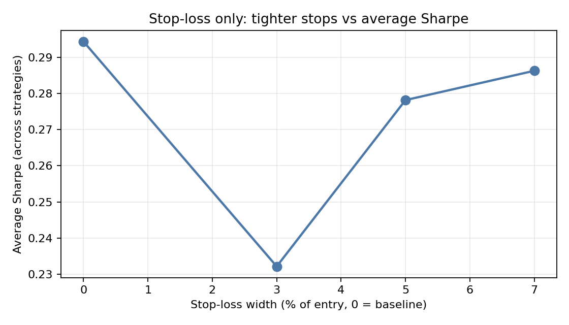
Only the stop under entry moves; profit targets are turned off for this experiment. The left end is “no fixed stop” in this setup.
Reading the chart
- Upward slope: the average strategy Sharpe rises when the stop is wider (often fewer whipsaws).
- Downward slope: tighter stops hurt the average Sharpe in this sample — cutting loss also cuts good trades.
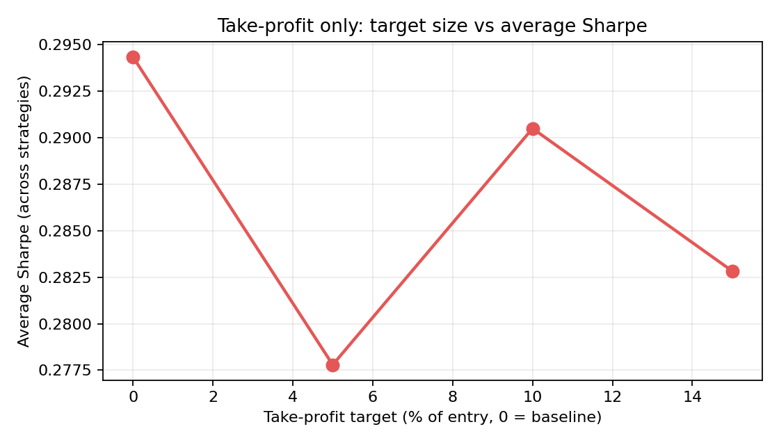
Only the profit target above entry moves; stops are off for this sweep. The left end is “no fixed target” here.
Reading the chart
- Larger targets may help trend rules ride longer or hurt mean-reversion rules that mean-revert quickly.
- A flat line means this basket is insensitive to target choice in the tested range; a steep line means target choice matters.
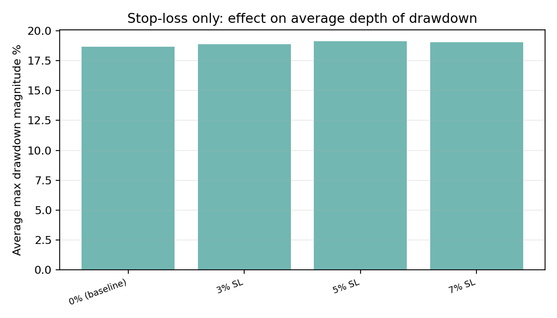
For each stop setting, height is the average of each strategy’s worst drawdown (%). Lower is shallower on average.
Reading the chart
- Tighter stops do not automatically produce smaller average drawdown — churn can create new drawdown episodes.
- Compare to the Sharpe line chart for the same sweep: you want joint insight, not one number alone.
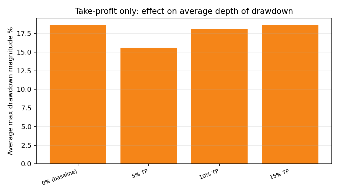
Same drawdown idea as the stop-only chart, but only profit targets change. Baseline is the first bar.
Reading the chart
- Compare bar heights across 5%, 10%, 15% targets vs baseline — sometimes wider targets smooth the path.
- Pair with the take-profit vs Sharpe line to reason about risk and return together.
Interactive lab: stops and targets
Experiment design: fix 71 textbook-style strategies, one price series (^GSPC, 5y of daily data), then change only the stop-loss and/or take-profit rule. Every plotted value is an unweighted average across those strategies — a classroom-friendly summary, not an optimized portfolio. Last computed: 8 Jun 2026, 12:37.
Compare scenarios: average Sharpe, return, and drawdown
- Avg Sharpe
- Avg return (%)
- Avg max DD (%)
Important: Sharpe (no units), return (%), and drawdown (%) share one vertical axis for compact display — compare blue bars to blue bars across scenarios, green to green, red to red. Do not compare blue height to green height as if they were the same quantity.
Stop-loss only: how average Sharpe moves
Y-axis: simple average of each strategy's Sharpe at that stop. X-axis: stop width as a percent below entry (for example 5 means exit if price drops 5% below where you bought).
Take-profit only: how average Sharpe moves
Y-axis: same averaging idea as the stop chart. X-axis: target as a percent above entry — a 10 means lock gains if price rises 10% above entry, under the rules of the simulator.
Stop-loss only: average depth of drawdown
Shorter bars mean a shallower average drawdown in this basket. Averages are unweighted — each strategy counts the same, which is fine for teaching but not the same as a dollar-weighted book.
Take-profit only: average depth of drawdown
Read next to the take-profit vs Sharpe line: a target that lifts Sharpe might still change how deep the typical path dips.
Per-strategy SL/TP surface
Select a strategy to inspect its individual response surface instead of only basket averages. The table shows Sharpe by stop-loss (rows) and take-profit (columns), and the two curves isolate one dimension at a time for that selected strategy.
